I craft products with purpose and a little bit of magic
User Focus
User Focus
User Focus
Product
Product
Strategy
Strategy
Strategy

Deep User Empathy
I approach user research like Werner Herzog approaches interviews—with silence, genuine curiosity, and space for people to be honest. I uncover the needs users can't articulate and translate them into product strategy.

Deep User Empathy
I approach user research like Werner Herzog approaches interviews—with silence, genuine curiosity, and space for people to be honest. I uncover the needs users can't articulate and translate them into product strategy.

Deep User Empathy
I approach user research like Werner Herzog approaches interviews—with silence, genuine curiosity, and space for people to be honest. I uncover the needs users can't articulate and translate them into product strategy.

Strategic Product Vision
I excel at high-level thinking: connecting human behavior to business goals, mapping opportunity spaces, and aligning teams around a compelling story. Give me a complex problem and I'll find the insight others miss.

Strategic Product Vision
I excel at high-level thinking: connecting human behavior to business goals, mapping opportunity spaces, and aligning teams around a compelling story. Give me a complex problem and I'll find the insight others miss.

Strategic Product Vision
I excel at high-level thinking: connecting human behavior to business goals, mapping opportunity spaces, and aligning teams around a compelling story. Give me a complex problem and I'll find the insight others miss.

Behavioral Design Craft
Whether it's gamification or crafting moments of delight, I understand what motivates people. I design engagement systems that respect users: no dark patterns, no manipulation, just thoughtful product craft.

Behavioral Design Craft
Whether it's gamification or crafting moments of delight, I understand what motivates people. I design engagement systems that respect users: no dark patterns, no manipulation, just thoughtful product craft.

Behavioral Design Craft
Whether it's gamification or crafting moments of delight, I understand what motivates people. I design engagement systems that respect users: no dark patterns, no manipulation, just thoughtful product craft.
I worked
for
Brands
Brands

Pigzbe

QUBS TOYS

OAG

Bright Little Labs

Global Media

NatWest

Pigzbe

QUBS TOYS

OAG

Bright Little Labs

Global Media

NatWest
5
+
Products That Don't Suck
5
+
Products That Don't Suck
+
Products That Don't Suck
100
+
k
Happy users
100
+
k
Happy users
+
Happy users
6
+
Years Making Magic
6
+
Years Making Magic
+
Years Making Magic
∞
+
Chocolate Bars Eaten
∞
+
Chocolate Bars Eaten
+
Chocolate Bars Eaten
Numbers
What I do
(and do well)
Skills
Skills
Strategic Product Leadership
Connecting vision to execution, humans to business goals
Vision & roadmapping
Opportunity identification
Storytelling for alignment
Team leadership
Business innovation
Market positioning
I thrive at the strategic level, defining long-term product vision, identifying market opportunities, and aligning cross-functional teams around a compelling story. I translate user insights into business strategy and make sure everyone's rowing in the same direction.
User Research & Insight
Uncovering the needs people can't articulate
Qualitative research
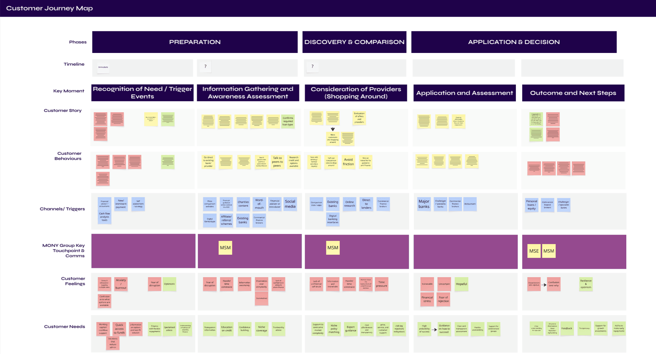
Journey mapping
Experience design
Research synthesis
Insight generation
Building empathy
Ethnographic observation
I approach user research with genuine curiosity and the power of silence. I create space for people to be honest, uncover latent needs, and translate messy human truths into clear product strategy.
Behavioral Design & Engagement
Designing motivation systems that respect users
Gamification
Habit formation & retention
Behavioral psychology
Progression mechanics
Reward systems
Anti-dark pattern advocacy
Whether it's gamification, nudge design, or crafting moments of delight, I understand what makes people tick. I design engagement systems rooted in intrinsic motivation: autonomy, mastery, relatedness. Not manipulation or guilt.
Experience Design & Craft
Where design thinking meets product strategy
Design collaboration
Prototyping & validation
Accessibility-first design
Microinteraction & delight
With a design background, I bridge the gap between what's beautiful and what works. I think in experiences, not features, and I obsess over the small details that show users you actually care about their journey.
Strategic Product Leadership
Connecting vision to execution, humans to business goals
User Research & Insight
Uncovering the needs people can't articulate
Behavioral Design & Engagement
Designing motivation systems that respect users
Experience Design & Craft
Where design thinking meets product strategy
Why work with me
Benefitsss
Benefitsss

Human Psychology Meets Business Goals
I understand what motivates people: autonomy, mastery, relatedness. Whether it's designing gamification or mapping journeys, I build products for humans first, and that's what drives retention and revenue.

Human Psychology Meets Business Goals
I understand what motivates people: autonomy, mastery, relatedness. Whether it's designing gamification or mapping journeys, I build products for humans first, and that's what drives retention and revenue.

Human Psychology Meets Business Goals
I understand what motivates people: autonomy, mastery, relatedness. Whether it's designing gamification or mapping journeys, I build products for humans first, and that's what drives retention and revenue.

Strategy Over Execution
I bring the most value at the strategic level, defining vision, identifying opportunities, and aligning teams around a story. I see patterns across industries and translate them into opportunities.

Strategy Over Execution
I bring the most value at the strategic level, defining vision, identifying opportunities, and aligning teams around a story. I see patterns across industries and translate them into opportunities.

Strategy Over Execution
I bring the most value at the strategic level, defining vision, identifying opportunities, and aligning teams around a story. I see patterns across industries and translate them into opportunities.

Proven Across Industries
EdTech, FinTech, AdTech, TravelTech. I've built products for kids learning to code and adults planning retirement. I find universal human truths and apply them in radically different contexts.

Proven Across Industries
EdTech, FinTech, AdTech, TravelTech. I've built products for kids learning to code and adults planning retirement. I find universal human truths and apply them in radically different contexts.

Proven Across Industries
EdTech, FinTech, AdTech, TravelTech. I've built products for kids learning to code and adults planning retirement. I find universal human truths and apply them in radically different contexts.

Craft Over Tricks
I believe in thoughtful design. I sweat the small details that show users you actually care about their experience.

Craft Over Tricks
I believe in thoughtful design. I sweat the small details that show users you actually care about their experience.

Craft Over Tricks
I believe in thoughtful design. I sweat the small details that show users you actually care about their experience.

Deep Empathy, Real Insights
I approach users with genuine curiosity. I uncover the needs people don't even realize they have.

Deep Empathy, Real Insights
I approach users with genuine curiosity. I uncover the needs people don't even realize they have.

Deep Empathy, Real Insights
I approach users with genuine curiosity. I uncover the needs people don't even realize they have.

Cross-Discipline Innovation
I bring perspectives most PMs don't have. I think in stories, systems, and experiences. I find insights in unusual places and apply them in unexpected ways.

Cross-Discipline Innovation
I bring perspectives most PMs don't have. I think in stories, systems, and experiences. I find insights in unusual places and apply them in unexpected ways.

Cross-Discipline Innovation
I bring perspectives most PMs don't have. I think in stories, systems, and experiences. I find insights in unusual places and apply them in unexpected ways.

Bridge Design and Business
I started in design, then got my MBA while working full-time, and even ran a startup as general manager. I understand what's beautiful, what's possible, and what drives revenue. And I know how to balance all three.

Bridge Design and Business
I started in design, then got my MBA while working full-time, and even ran a startup as general manager. I understand what's beautiful, what's possible, and what drives revenue. And I know how to balance all three.

Bridge Design and Business
I started in design, then got my MBA while working full-time, and even ran a startup as general manager. I understand what's beautiful, what's possible, and what drives revenue. And I know how to balance all three.
Look what I made!
Portfolio
Portfolio

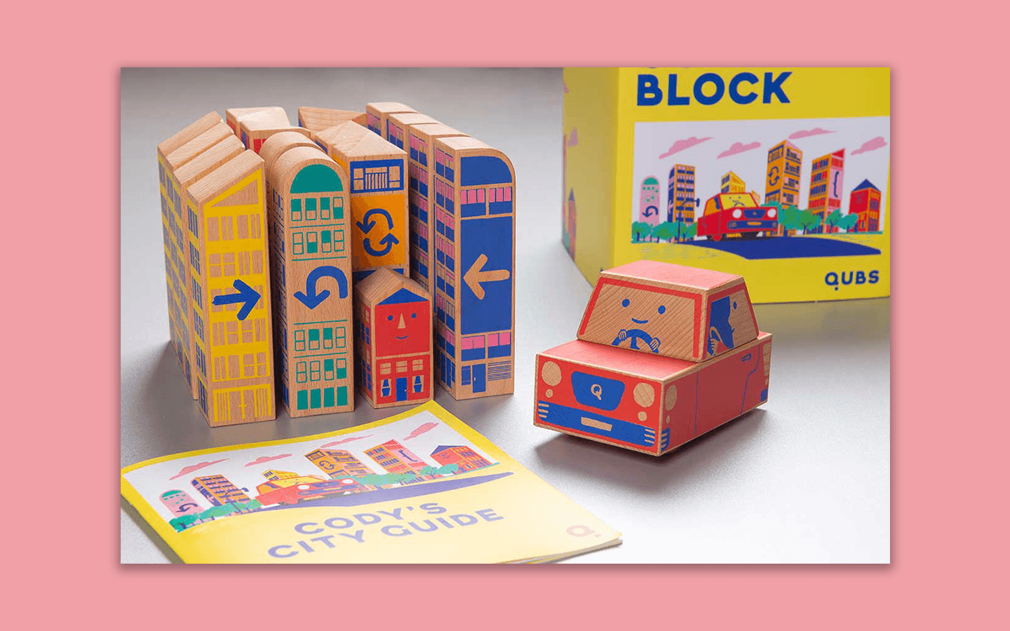
From Kickstarter to Launch: Building a Physical Product That Teaches Code


From Kickstarter to Launch: Building a Physical Product That Teaches Code


From Kickstarter to Launch: Building a Physical Product That Teaches Code

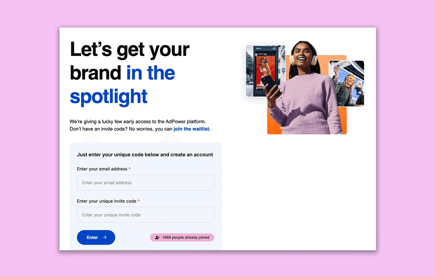
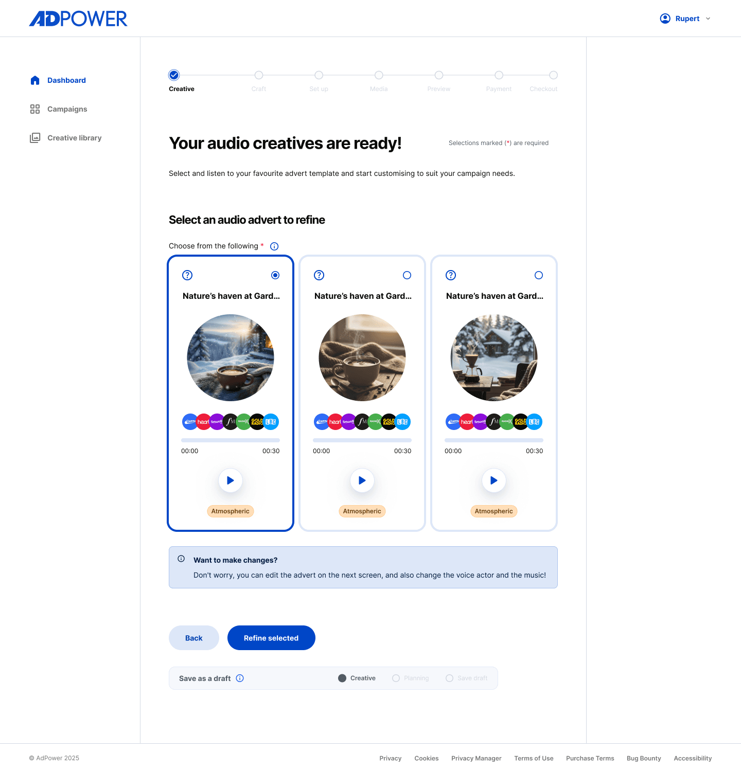
Building the first Out of Home self-service advertising Platform


Building the first Out of Home self-service advertising Platform


Building the first Out of Home self-service advertising Platform

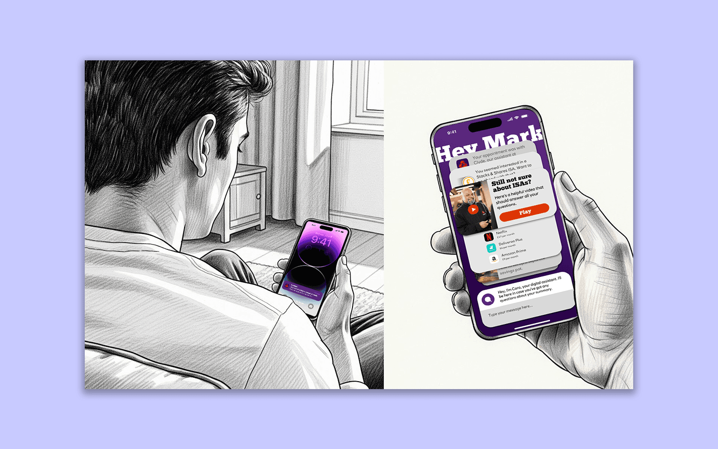
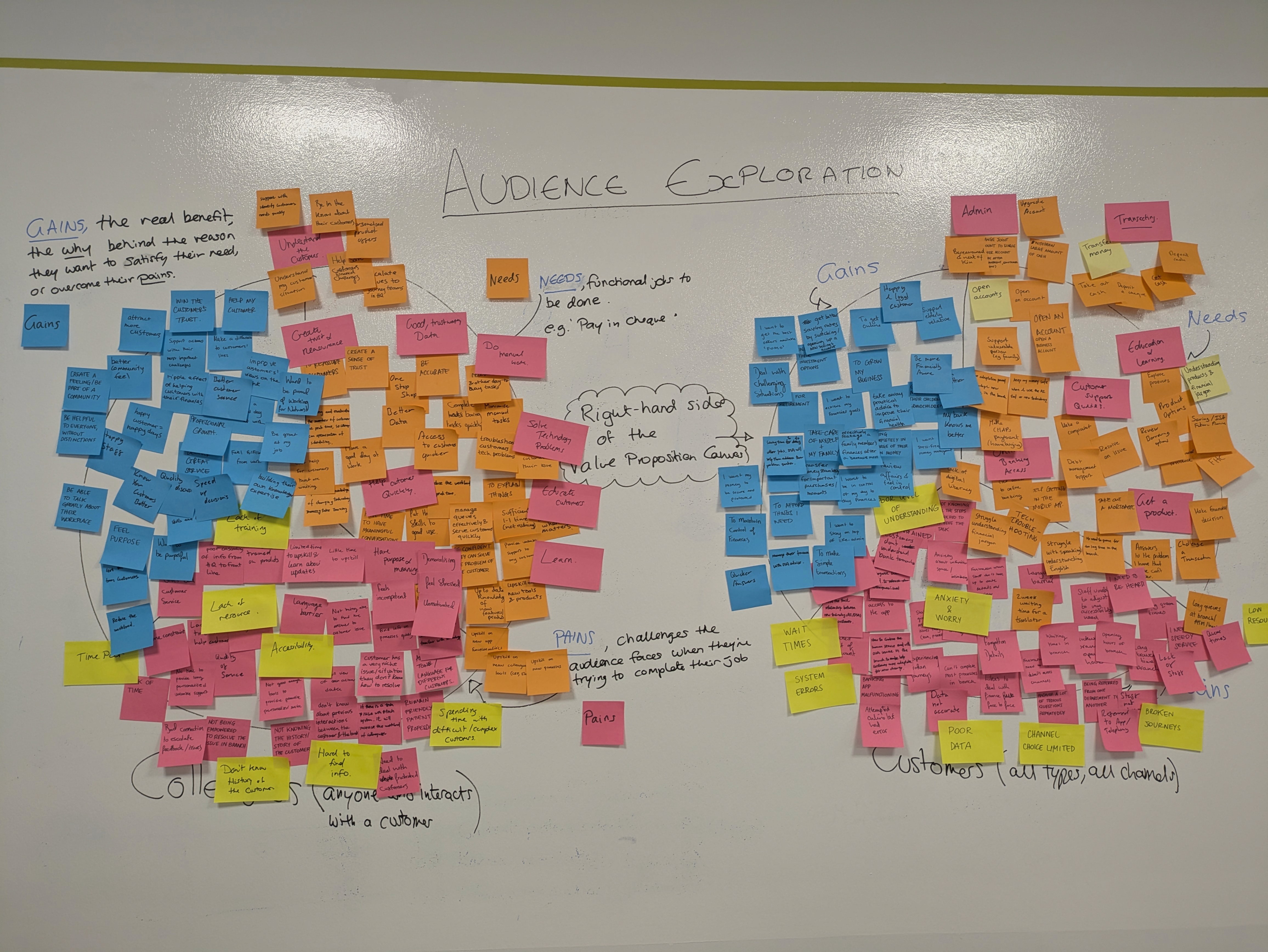
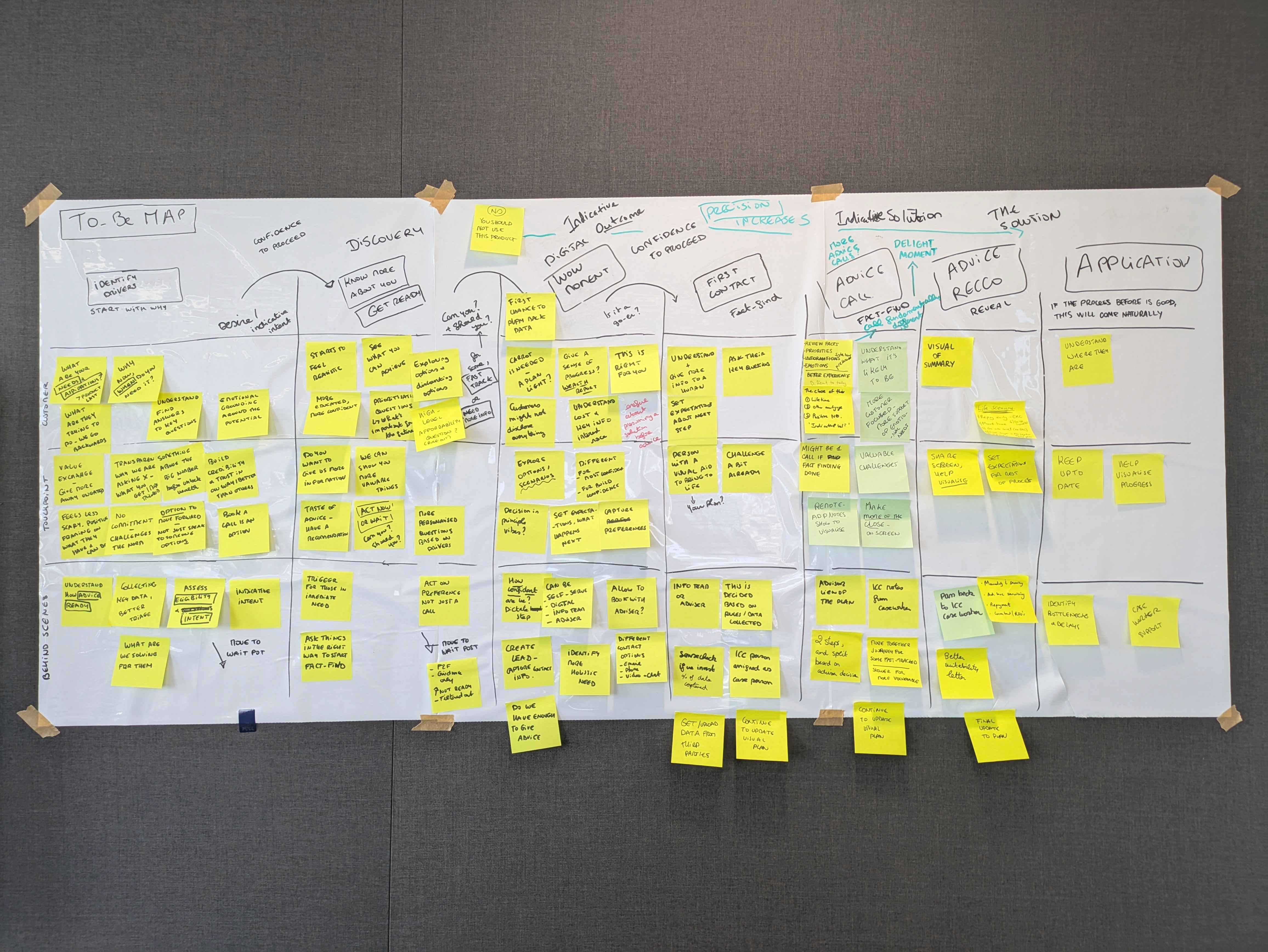
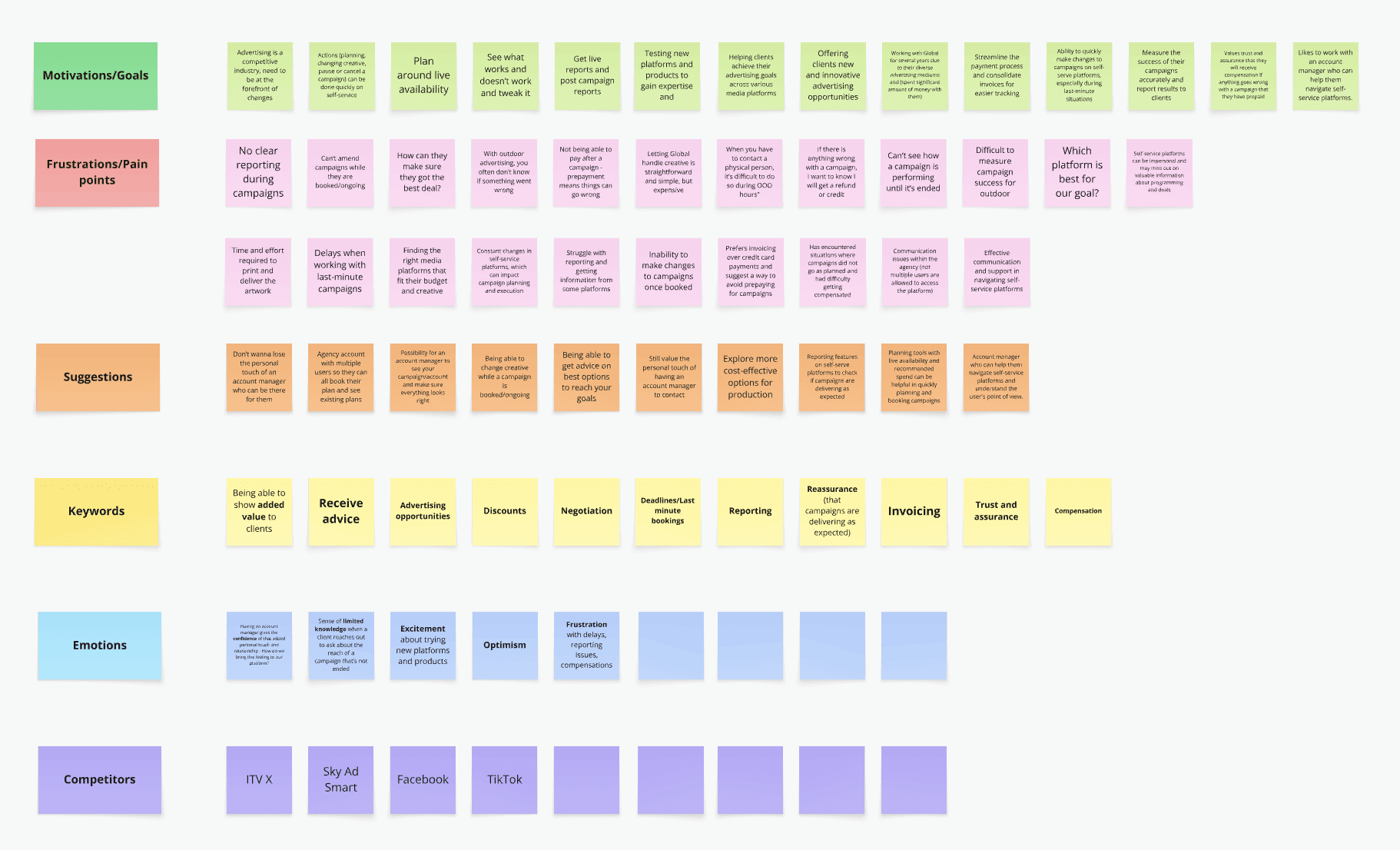
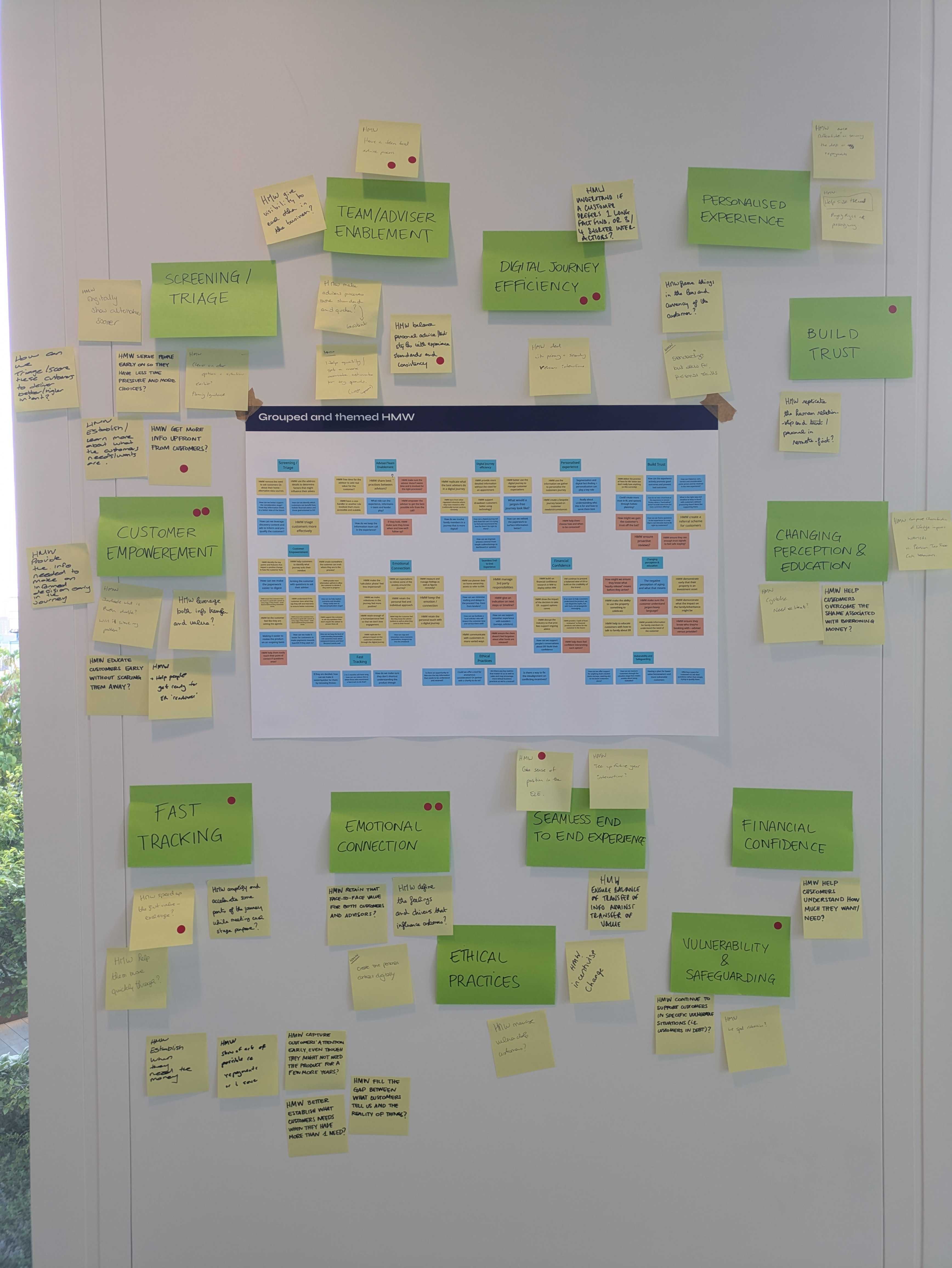
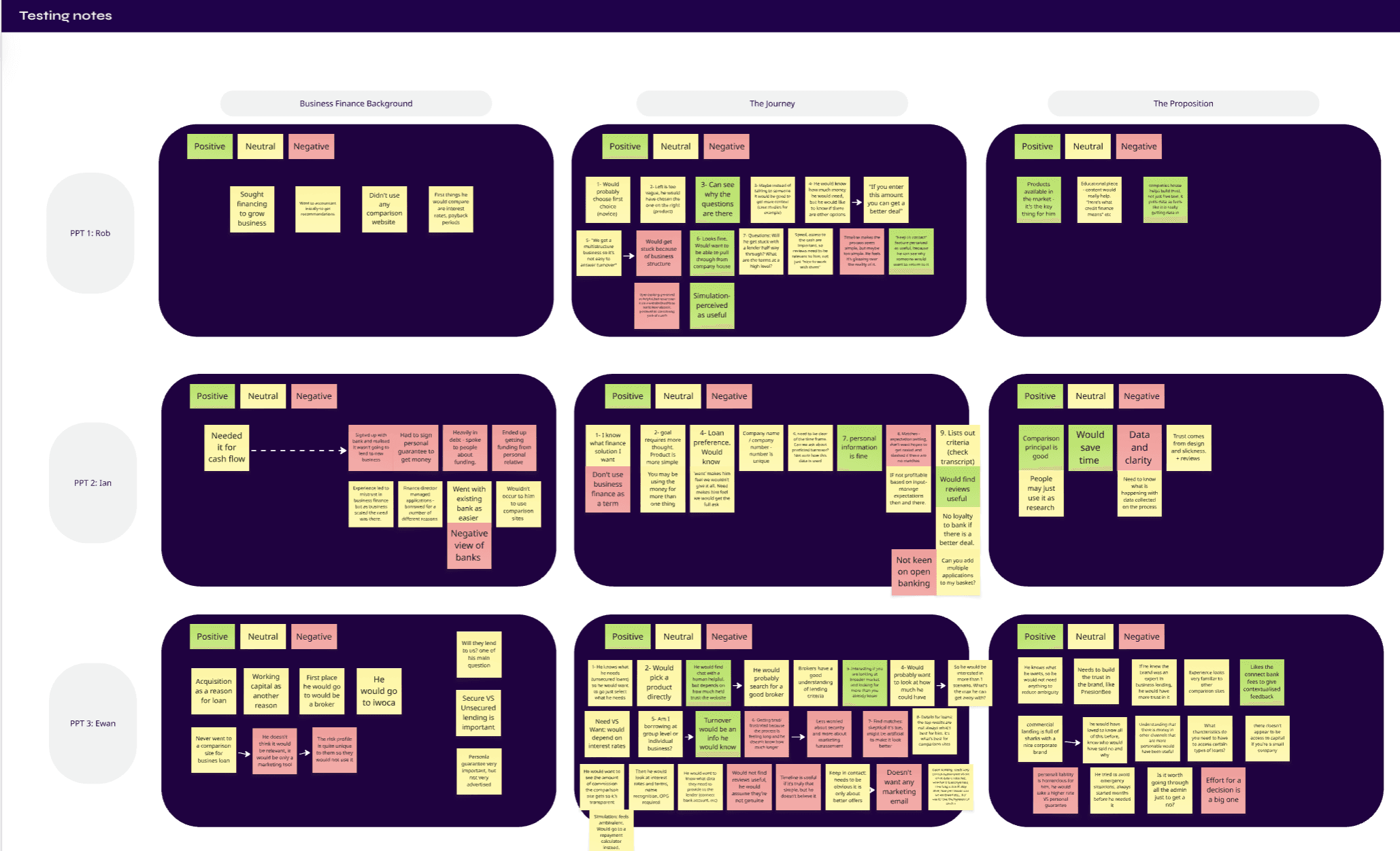
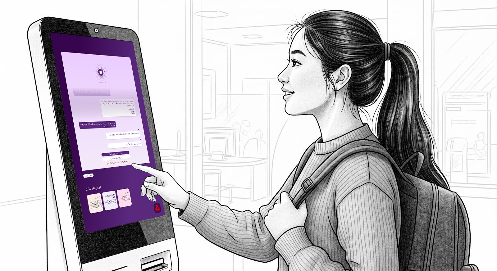
Reimagining the Future of In-Branch Banking Through AI


Reimagining the Future of In-Branch Banking Through AI


Reimagining the Future of In-Branch Banking Through AI

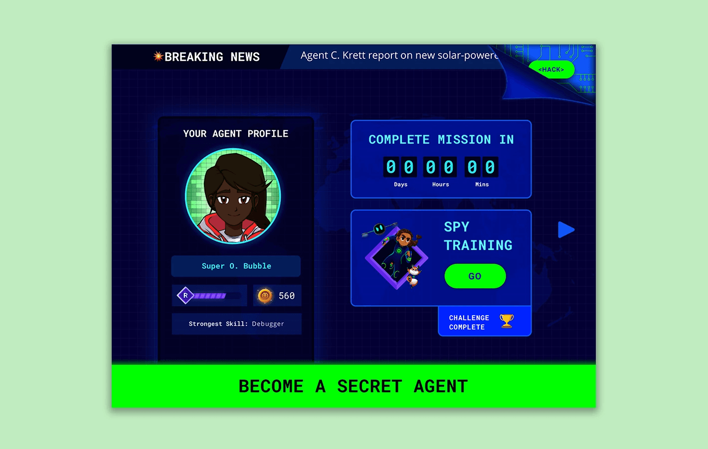
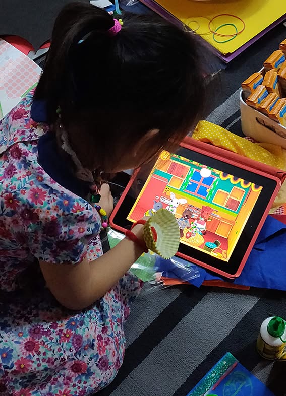
Helping children learn with spy-themed educational games


Helping children learn with spy-themed educational games


Helping children learn with spy-themed educational games

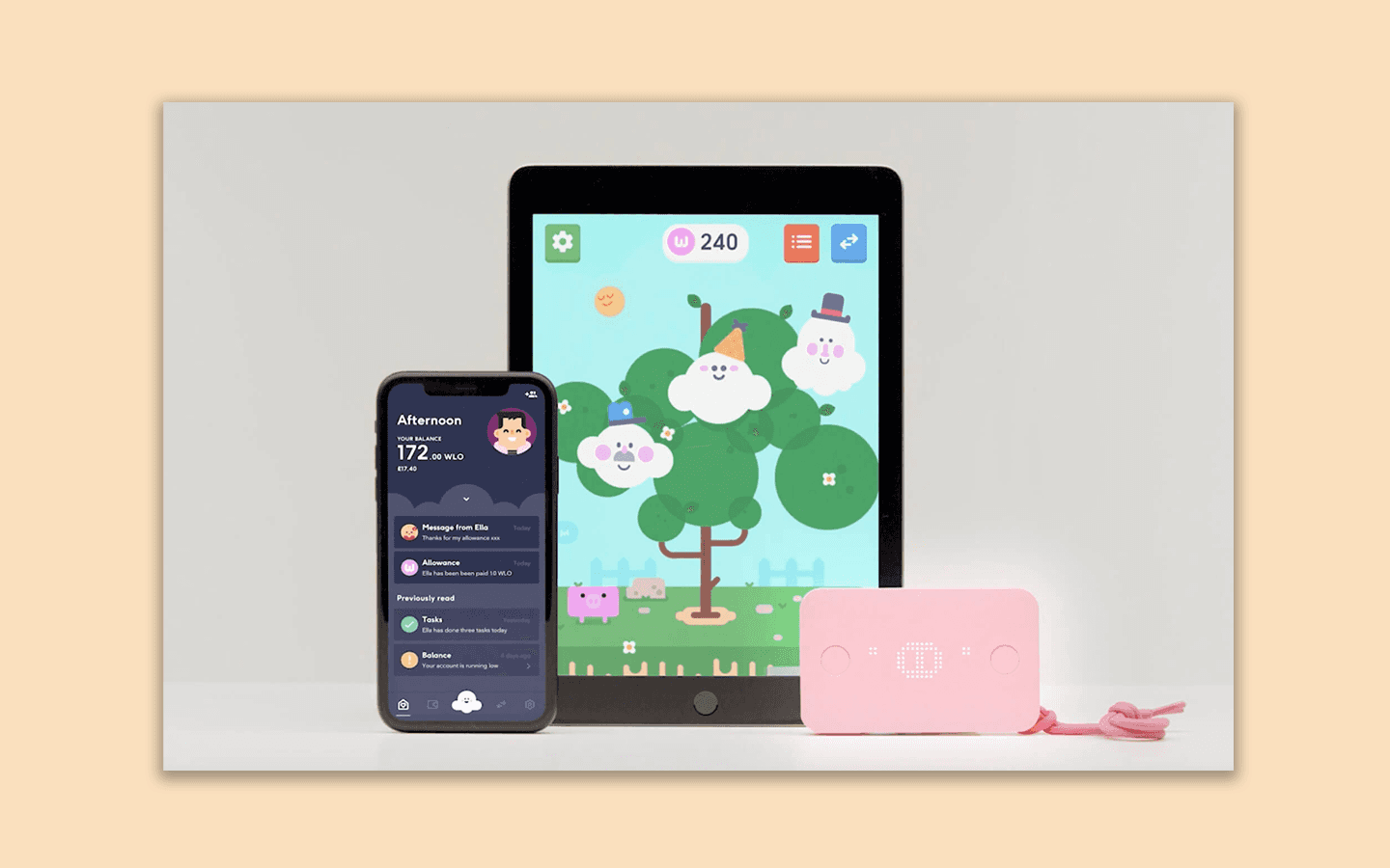
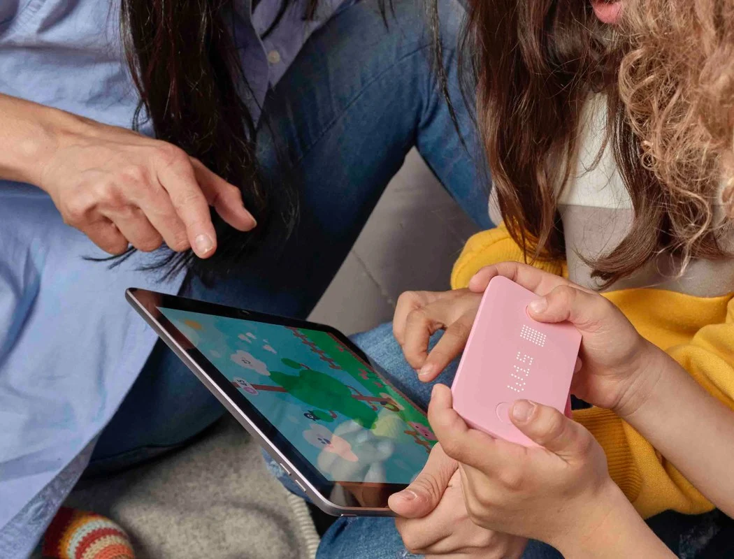
Creating an innovative crypto wallet for families


Creating an innovative crypto wallet for families


Creating an innovative crypto wallet for families


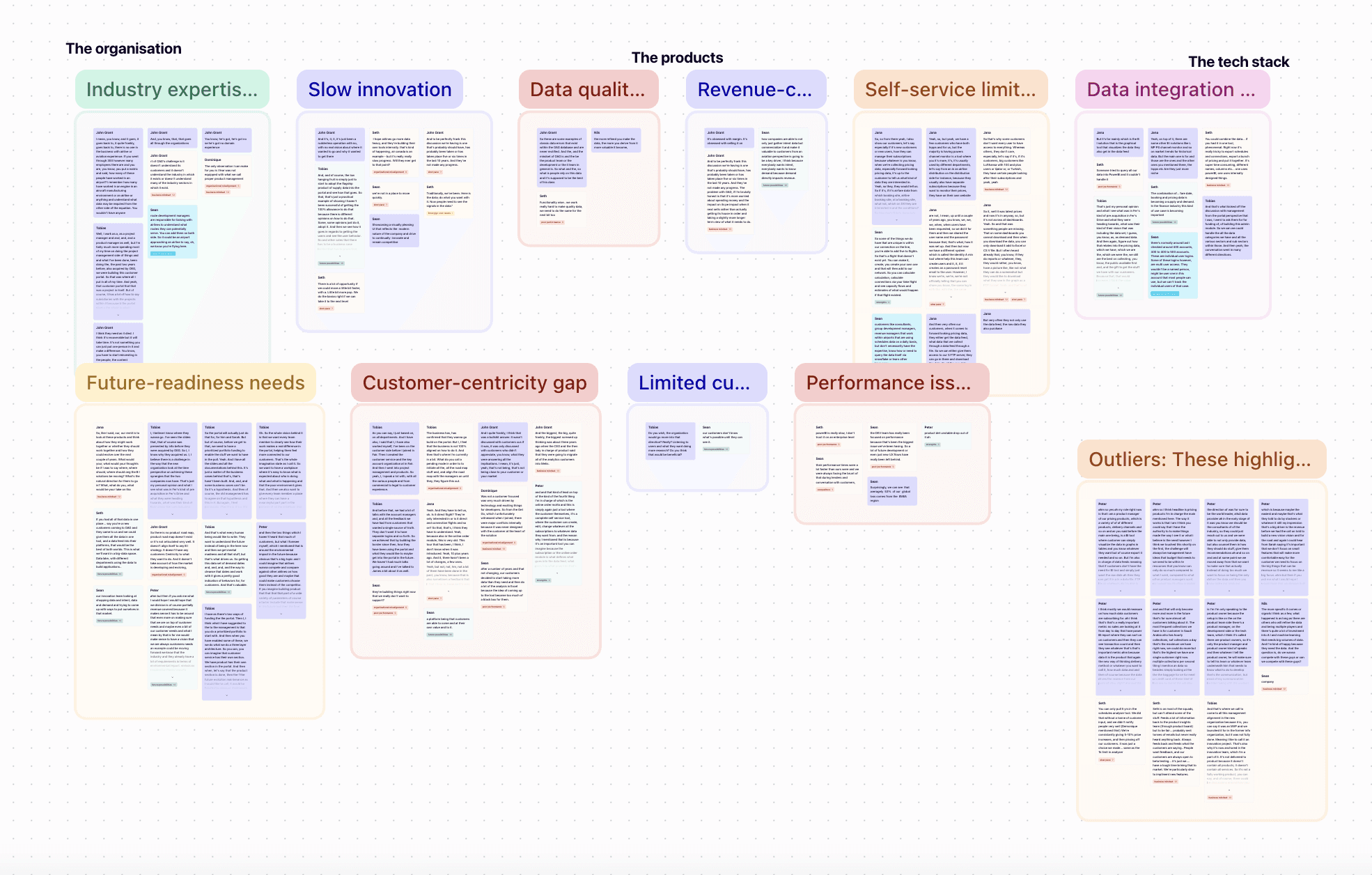
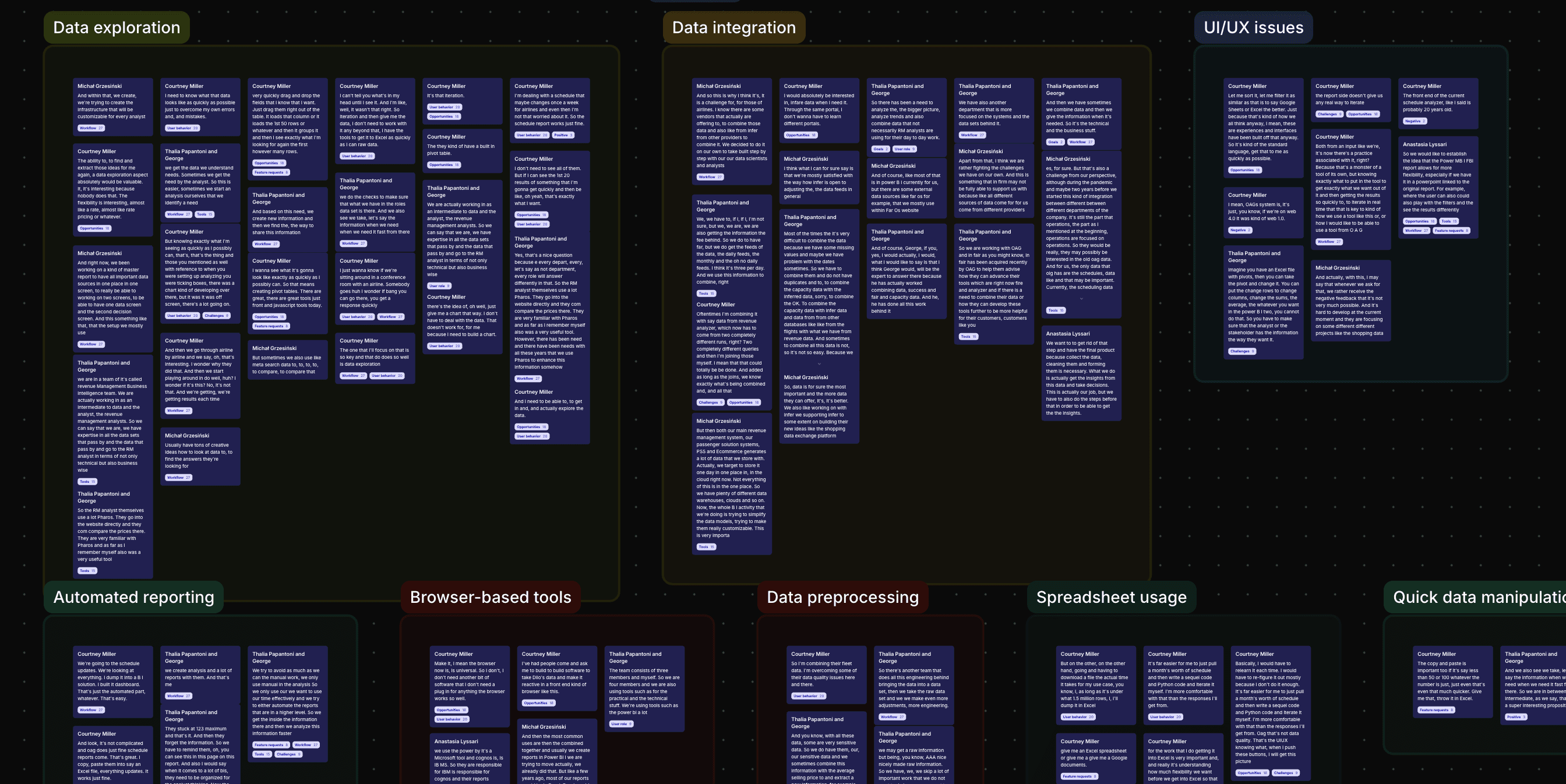
Strategising the future of BI solutions for OAG


Strategising the future of BI solutions for OAG


Strategising the future of BI solutions for OAG
What people say about me
Testimonials
Testimonials
Testimonials
Kristina Philip Says...
"Federica in short is a joy to work with. I have been incredibly impressed by her poise, maturity and diligent approach to her work. She is curios, collaborative and passionate about product and improving ways of working."
Head of Product, CreateFuture
Kara Bond Says...
"Federica’s strength is in putting the customer first and thinking about it from their perspective. She has great product instincts and is meticulous with her work."
Head of Technology, Global Media
Alessandro Paglia Says...
"I had the luck of working with Federica for 2 years. I was impressed with her ability to deliver, always go the distance. She is accountable and dependable. She is ready in thinking out of the box and finding solutions."
Product Monetisation Manager, Paramount+
James Dradge Says...
"Federica does a great job of listening and asking the right questions. She has really been on the front line maintaining the client relationship and setting expectations. She has become a trusted advisor and source of product knowledge for all of the key client team members."
Senior BA, Social Security Scotland
Sorin Cirlan Says...
“Federica if one of the most talented PMs I worked with and that's because of her strong leadership, people skills and a deep understanding of the product. Federica is talented, charismatic, intelligent, dedicated and positive, anyone from the team can say the same about her.”
Senior Product Designer, CreateFuture
Kevinjohn Gallagher Says...
"I wanted to say how great Federica was to work with. She was brilliant at taking my very specific “No I want this categorically” and my very vague “Here’s my problem, you solve it."
Delivery Manager, Freelance
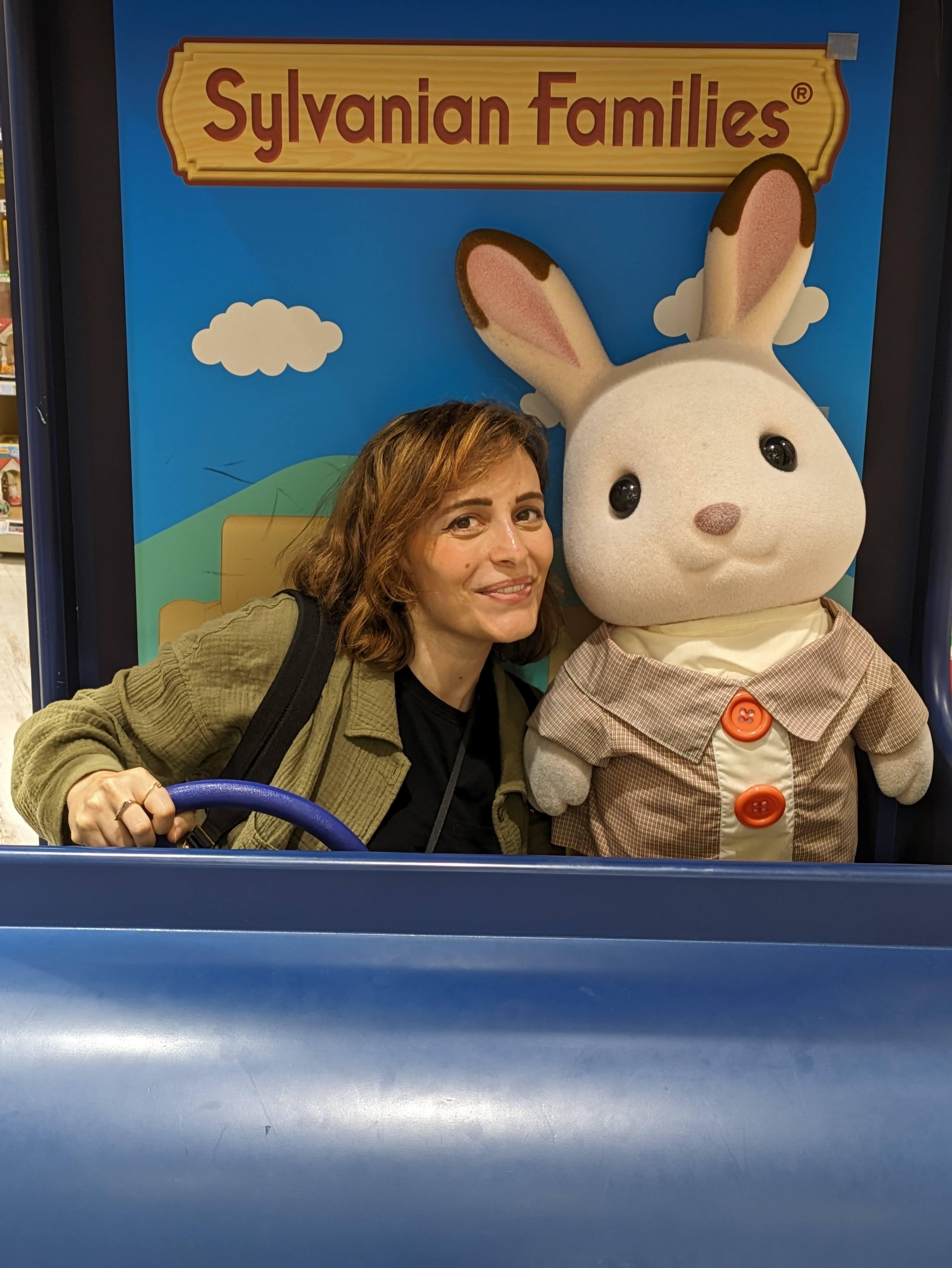
My journey has been wonderfully non-linear.
From a small Italian town to Copenhagen for an MSc in Game Design, to London. I got my MBA while working full-time and transitioned from design into product strategy, because I wanted to shape the "why" and "what," not just the "how."
What drives me:
I'm inspired by Japanese design philosophy, the small details that shows someone actually cared. The best products feel like someone thought about your experience, not just checked features off a list.
Outside of work, I'm endlessly creative and always pick up a new hobby. I believe play and playfulness are vital to how adults approach challenges. I'm fascinated by mindful living and the relationship between mind and body. Curiosity fuels everything: whether researching behavioral psychology, traveling for inspiration, or asking "why" until I uncover the real problem.
About me
Some career highlights:
Led and coordinated 4 Kickstarter campaigns that raised in total more than 1$ million
Products I worked on featured in Wired, Forbes, Financial Times, TechCrunch, Fast Company
Products Awards: Red Dot Best of the Best, Cannes Lion Gold, Monocle Design Award, D&AD
Board Advisor for socially-driven EdTech company Ambessa Play
Guest lecturer on game design, prototyping, and innovative thinking at NABA Milan
Speaker in Nordic Game Conference in Malmö
Master's thesis game, a demo of a stop-motion digital game about Vincent Van Gogh, featured on Killscreen and RockPaperShotgun
